A chest full
of character.
The visual identity of BloxStash,
a marketplace for Roblox goods.

A gaming world.
An identity of its own.
BloxStash is a marketplace for Roblox goods. We developed its brand identity, including the logo, palette, typography and usage guidelines.
- Our work
- Visual identity
- The core concept
- A chest and the letter S
- Deliverables
- Logo and guidelines
Searching for
our treasure.
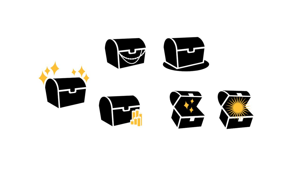
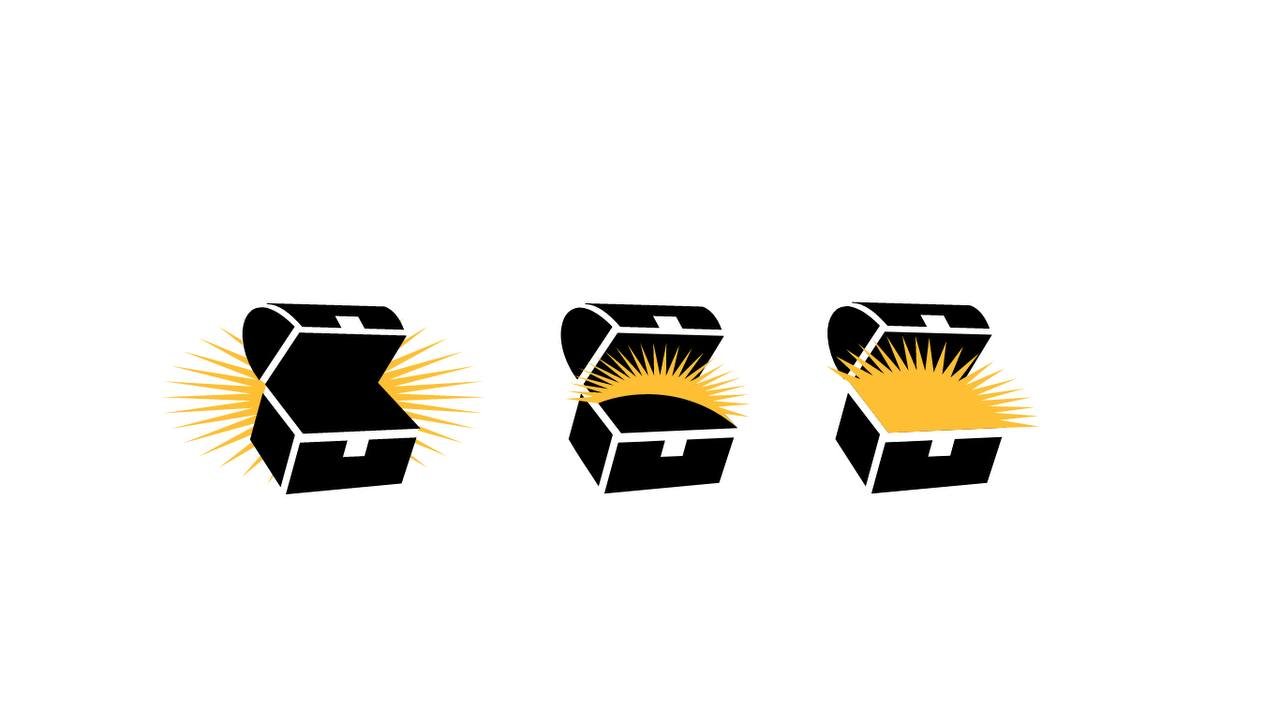
The early concepts explored chest shapes: open and closed silhouettes, coins, flashes and additional details.
From an object to a letter.
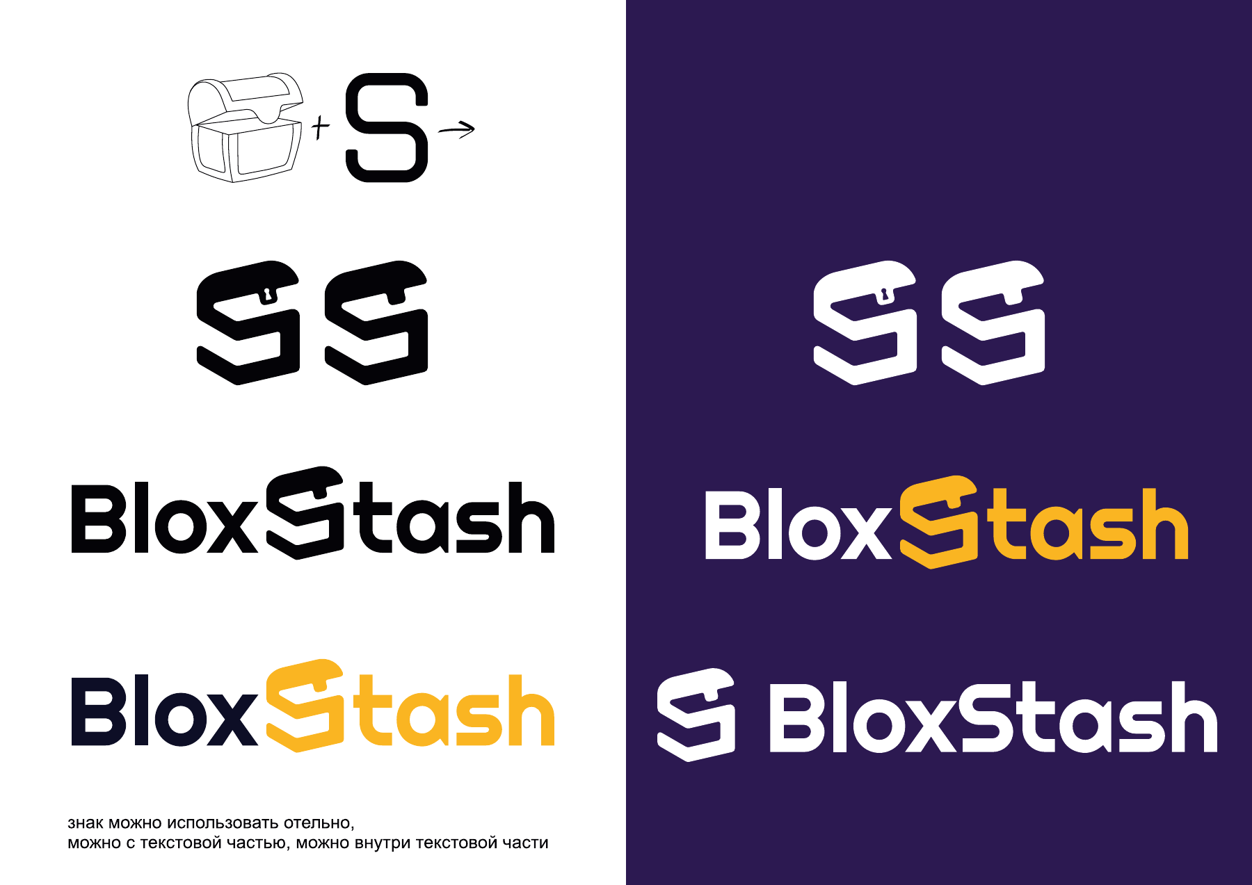
The next direction combined the chest with the S in the name. Below is an intermediate version that was later refined into the final logo.
A symbol within
the name.

The bold wordmark and geometric chest form a single word. The monochrome version preserves the shape without colour accents.
A yellow accent.
A deep dark tone.
White and neutral greys from the brand guidelines complement the primary pair.
The system
in detail.
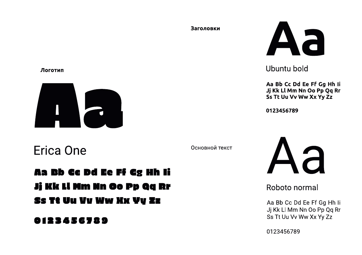
Erica One forms the basis of the logo.
Ubuntu Bold is used for headings.
Roboto Regular is used for body text.
The minimum clear space is half the symbol's width. The logo's proportions remain fixed when it is scaled.
The whole journey.
In one file.
11 slides covering the process and final BloxStash identity.
Open presentation