Cosmomed
Visual identity for a clinic
specialising in medical and therapeutic cosmetic care.
A calm tone.
Attention to detail.
Cosmomed is a medical and therapeutic cosmetic clinic in Penza. This presentation traces the visual identity from early symbol exploration to a complete brand system.
- Field
- Brand identity
- The system's foundations
- Logo, palette and typography
- Presentation
- 13 slides on the design process
Searching for
the right identity.
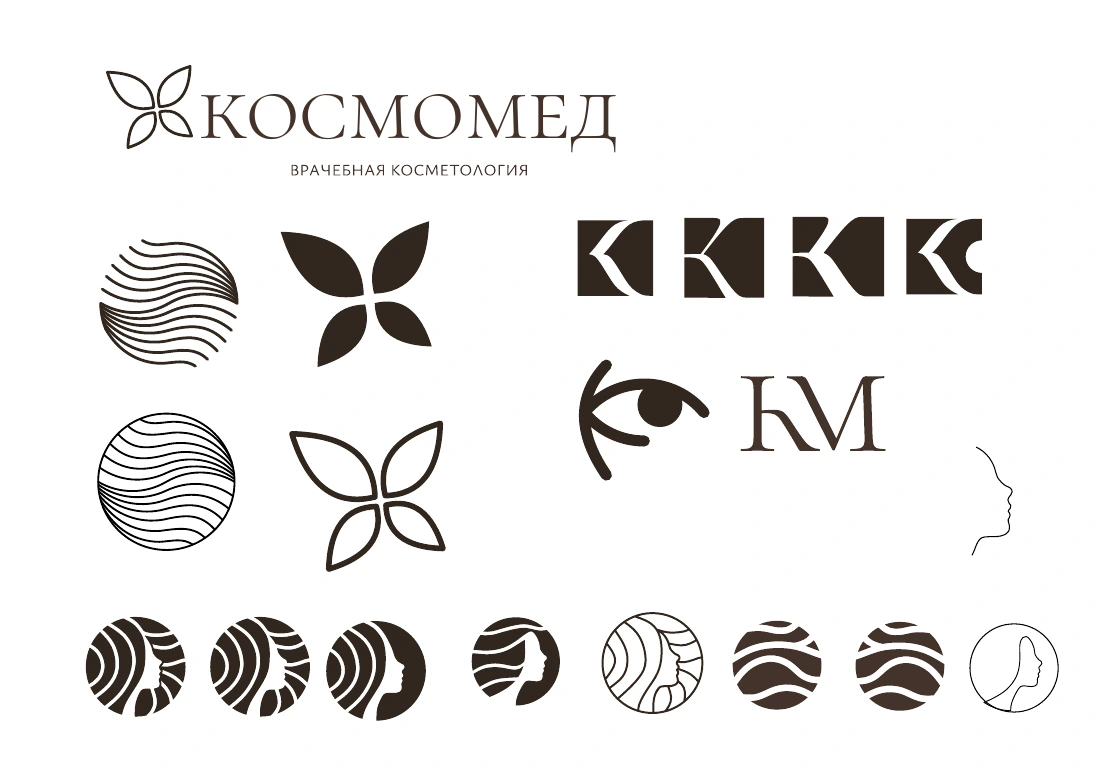
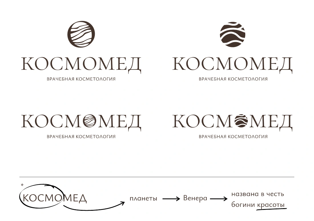
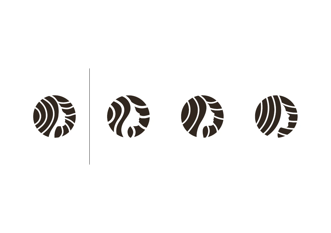
Early versions explored a profile, flowing lines, a flower and a monogram. Below are the actual exploration materials preceding the final design.
An identity that
brings it all together.
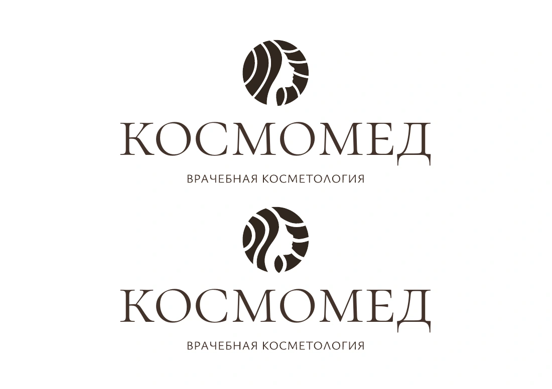
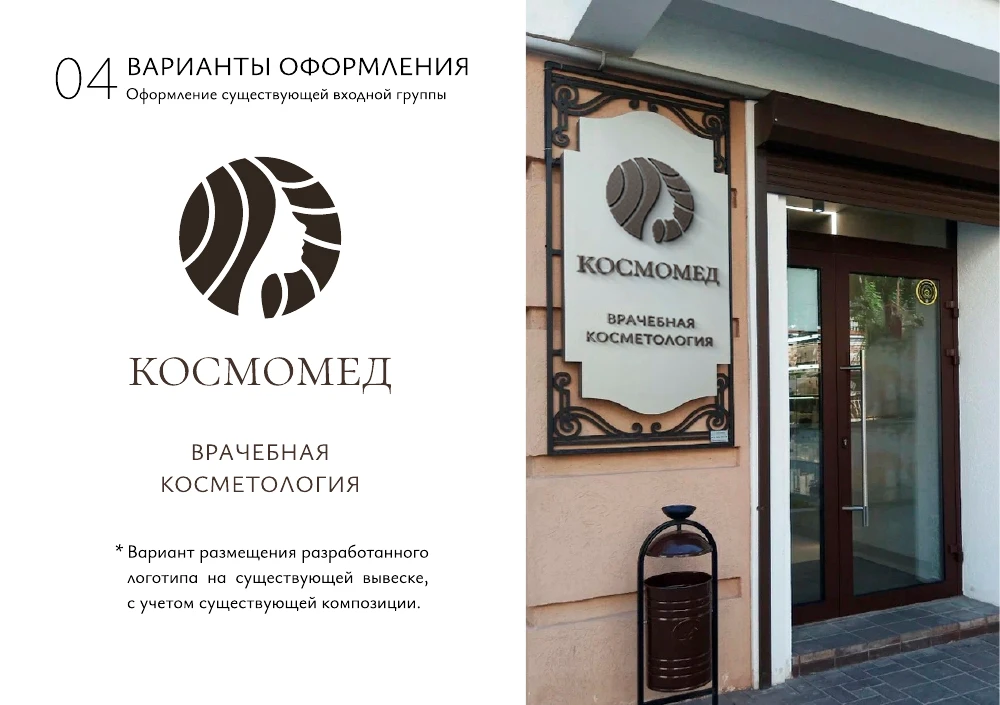
The primary version combines a circular symbol with the name. Additional compositions allow the logo to be used in different proportions.


A soft palette.
Expressive typography.
A muted accent and a light background complement the primary dark tone. The type pairing in the guidelines is Cormorant SC and Ysabeau Infant.
Beyond
the logo.
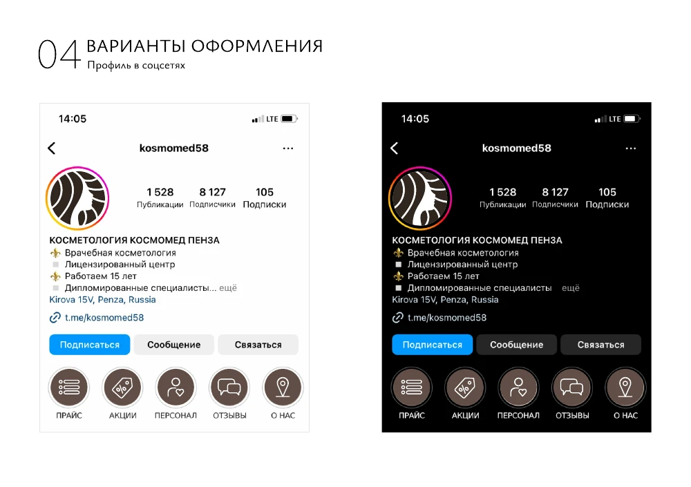
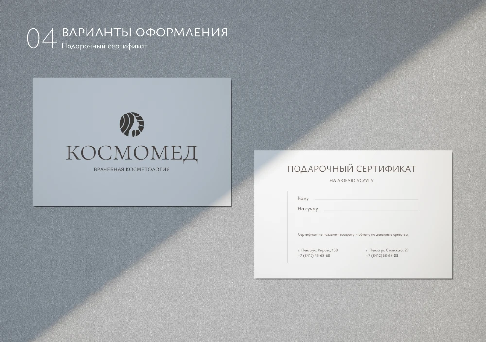
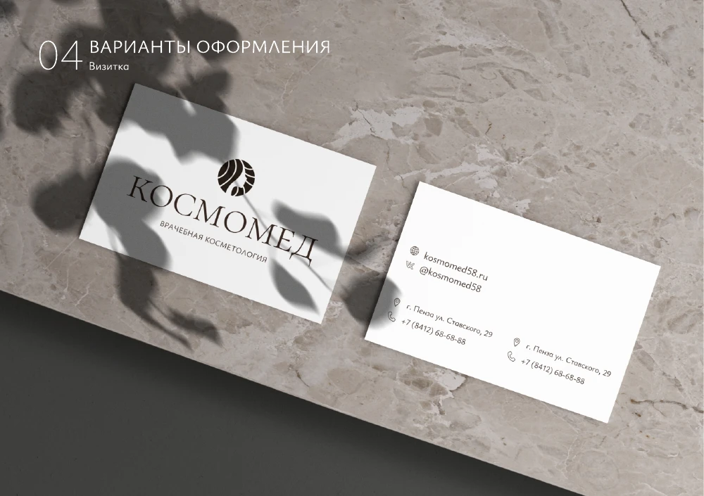
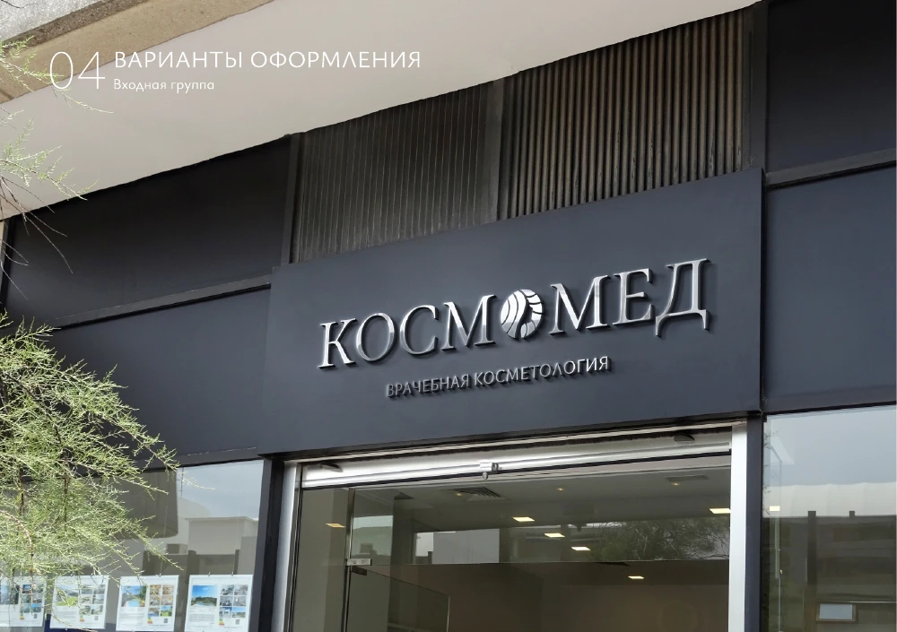
Examples from the guidelines show how the identity works across social media, printed materials and the clinic's interior and exterior.
From the first concepts
to the final identity.
13 slides: the process, current logos and examples of applications.
Open presentation